It all begins with a question.
How come there's still no easier way to find locations for Insta-worthy photos when there are over a billion users on Instagram?
Exam 2021
App design
Software
Adobe XD
Photoshop
After Effects
Kudos
Photos from Unsplash and Pexels
Mockups from Mockupworld
Overview
In this project, my aim is to create a compelling app called Photospots. This app is designed with a primary focus on catering to photo enthusiasts and travelers. Its core mission is to inspire users to pick up their cameras and venture outdoors to discover new and captivating scenes. Photospots is dedicated to reigniting people's passion for the world beyond their screens and nurturing the interests of photography enthusiasts of all levels.
Challenge
How can I create a tool that empowers photo enthusiasts to seamlessly and effectively discover and exchange remarkable photography locations?
Summary of interviews
I conducted semi-structured interviews with three individuals to delve into their thoughts, desires, and requirements concerning sightseeing and their passion for photography. My interview approach involved utilizing a predetermined list of questions as a foundation, but I also employed follow-up queries to foster a more natural conversation flow and to glean additional, valuable insights. The core focus of these interviews was to uncover the sources of their inspiration and the driving forces behind their photography pursuits.
Valuable findings
1. Photography is a time-consuming hobby and difficult to pursue without intent or goal
2. It takes a lot of research and planning to find and travel to photo destinations
3. Photo enthusiasts often associate photography with travel
3. Photographers use multiple apps to find inspiration and destinations to take pictures at
4. Interviewees find that Instagram’s focus has shifted from photography sharing to mainly marketing and video content
6. The market for photo editing tools is saturated, and the users have multiple editing apps they never use
5. Serious photographers edit their content mostly on PC or Mac
7. Instagram is currently the only platform that provides exposure, but interviewees are not happy about the orientation around likes and followers
Conclusion
Based on the insights gathered from the interviews, it became evident that there is currently no specialized platform catering to the needs of photography enthusiasts. The interviewees identified photography as a challenging hobby, primarily due to the extensive planning and research involved in discovering suitable destinations. A noteworthy discovery was the significant pain point associated with the user journey of locating photography spots. Photographers often find themselves juggling multiple apps such as Instagram, Google, and Google Maps to identify their desired destinations. This disjointed process is particularly frustrating because photography enthusiasts tend to associate their passion with travel, as it is during these journeys that documenting special events and capturing extraordinary moments holds the utmost significance.
Personas
To gain a more comprehensive understanding of our target audience, it's essential to create personas. These personas are fictional portrayals of individuals who represent the various segments within our broad photo enthusiast target group. By developing three distinct personas, each with unique backgrounds, needs, and desires, we aim to create a more holistic and diverse profile of the individuals we're designing our app for.
Within the expansive realm of photo enthusiasts, there exists a spectrum of commitment and motivation. Some are deeply invested in the art, while others possess an interest that lacks motivation, and then there are those who may not fully recognize their level of enthusiasm but engage in daily photography, often referred to as mobile photographers.
The three personas I've crafted—the Instagrammer, the traveler, and the photographer—serve as archetypal representations of these different segments. This approach allows us to tailor our app to cater to the distinct preferences and aspirations of this multifaceted audience.
Prototype and testing
There are multiple approaches to creating a low-level prototype, which serves as an initial, rudimentary representation of your design concept. The primary objective of a low-level prototype is to provide a simple and disposable visualization that can be refined based on user testing. These prototypes can take the form of hand-drawn sketches on paper or a poster adorned with post-it notes for a quick and adaptable illustration.
In a more extended project with ample time, it would be common to go through multiple iterations of low-level sketches and tests before identifying the optimal design. However, in my case, I opted for an XD prototype, which granted me a more detailed and digital version. This approach offered the advantage of providing a more realistic impression of the potential solution. Nevertheless, it's essential to acknowledge the potential downside, as the digital format may inadvertently constrain me to a particular concept or design direction.
By choosing an XD prototype, I gained a more tangible feel for the solution, which can be invaluable in certain contexts. However, it's essential to remain mindful of the potential limitations that digital prototypes may impose on the flexibility of the design process.
With the low-level prototype prepared, the next step was to subject it to testing. The primary objective of this user test was to determine whether the solution aligned with the findings gathered during the insight phase. During the test, meticulous documentation was essential, focusing on aspects that didn't resonate with the target audience and observing the users' interactions and behaviors concerning the prototype. This method ensured that the resulting solution remained firmly rooted in a user-centered approach, where the design evolves based on real user feedback and needs.


Feedback
Feedback is an invaluable source of insights for refining the prototype and ensuring it aligns with the user's needs and expectations. Here are the key takeaways from the user test:
1. User Engagement: The user actively engaged with the prototype, offering feedback on various features and appreciated the option to log in with an existing account to streamline the onboarding process.
2. Clarity of Main Page: The user expressed both admiration and confusion regarding the main page, appreciating the presented map but feeling unclear about its purpose and functionality.
3. Filter Customization: The user recognized the filter bar but desired the ability to personalize the filters and suggested incorporating a search feature for locations on the map.
4. Search Functionality: The user's satisfaction increased upon discovering the search button, emphasizing the importance of this feature in facilitating navigation and location discovery.
5. “Add" Functionality: The user was familiar with the "add" function and likened it to platforms like Instagram, feeling comfortable with its purpose.
6. Profile Page Symbol: While navigating to the "home" button and finding a profile, the user expressed surprise and suggested a unique symbol for the profile page to avoid associations with Instagram.
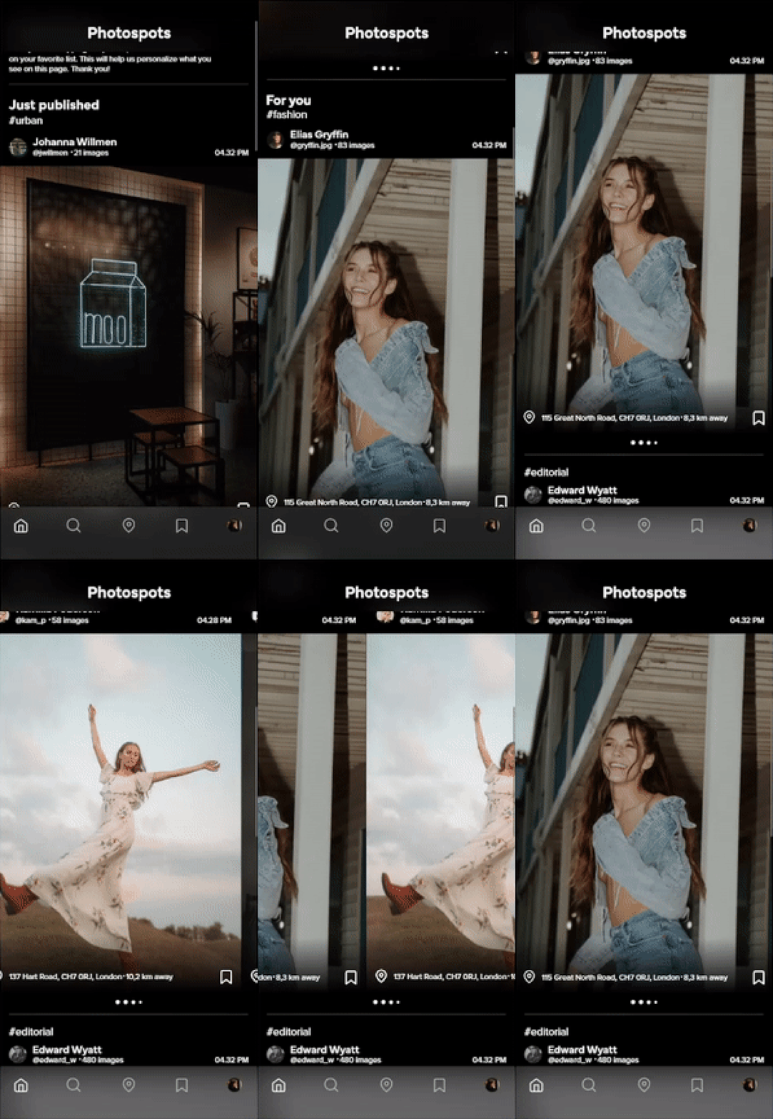
7. Balanced Focus: The user found the idea exciting and expressed an interest in using the platform. However, she noted that while the prototype emphasized posting pictures, it could benefit from more emphasis on exploring and discovering destinations.
These valuable insights provide clear direction for further refining the prototype, focusing on user-friendly features, customization options, and a balanced emphasis on both posting and exploring destinations.
Changes
Following a comprehensive review of the user test and careful examination of my notes, I have identified several crucial modifications that need to be made:
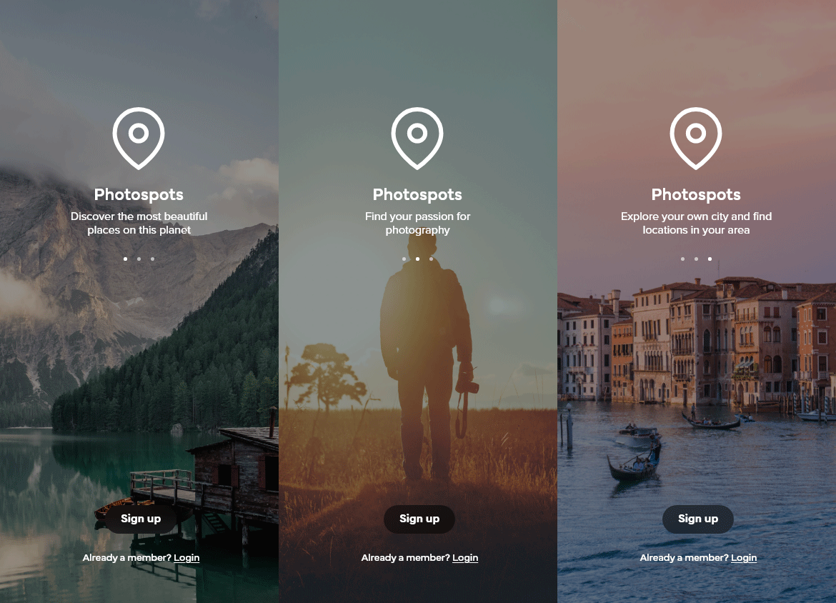
1. Introduction and Explanation: Recognizing that the user's initial question about the app's purpose highlighted a critical need, I have decided to incorporate an introductory section that provides users with a clear understanding of the app's mission. This is vital as, in real-world usage, I won't be present to explain its purpose.
2. Feature Clarification: While the user displayed familiarity with digital devices and applications, I acknowledge the necessity of implementing user-friendly feature explanations. This will ensure that all users, whether seasoned or newcomers, can easily grasp and utilize the app's features as intended.
3. Dissociation from Instagram: The user's frequent associations with Instagram prompted me to reevaluate the app's design and features. It's imperative that the app distinguishes itself from Instagram, shifting its emphasis towards the exploration of unique photography locations.
4. Universal "Profile" Button: To prevent any future misunderstandings, I will replace the "home" button with a universally recognizable "profile" button, eliminating ambiguity about its function.
5. Information Architecture: I plan to reconfigure the app's information architecture and the sequence of symbols in the global menu. This adjustment will rectify the initial user confusion caused by the presentation of a map at the outset of the user journey.
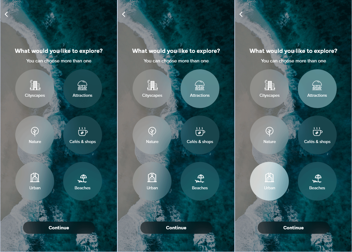
6. Enhanced Personalization: Recognizing the diverse styles and preferences of photographers, I intend to provide enhanced personalization options. This ensures that users receive content aligned with their specific interests, thereby enhancing their overall app experience.
These revisions are aimed at making the app more user-centric, distinct, and tailored to meet the unique needs of photography enthusiasts, addressing the concerns raised during the user testing phase.


UX
Call to action
Similar way we can't expect users to understand the app right away, nor can we expect them to read the small text that says “sign in with” or "you can also". Instead, I decided to describe what the buttons do so it's easier for users to make a choice. This way, there is also less chance of losing users who are demotivated by having to create a user. I have used this in other features of the app. A call to action (CTA) is about letting people find what they are looking for first and then guiding them further. Call to action is the art of identifying the appropriate times to present relevant ways to keep the customer active.
Feedback
One of Donald A. Norman's seven design principles is feedback. An app should always give the user feedback on what the consequences of their actions are and what the current state of the app is. Visibility is another design principle, which is about always being clear about what can be done next with the product or what the next step is. Designing services requires good communication between the service and the user at all times.
Introduction
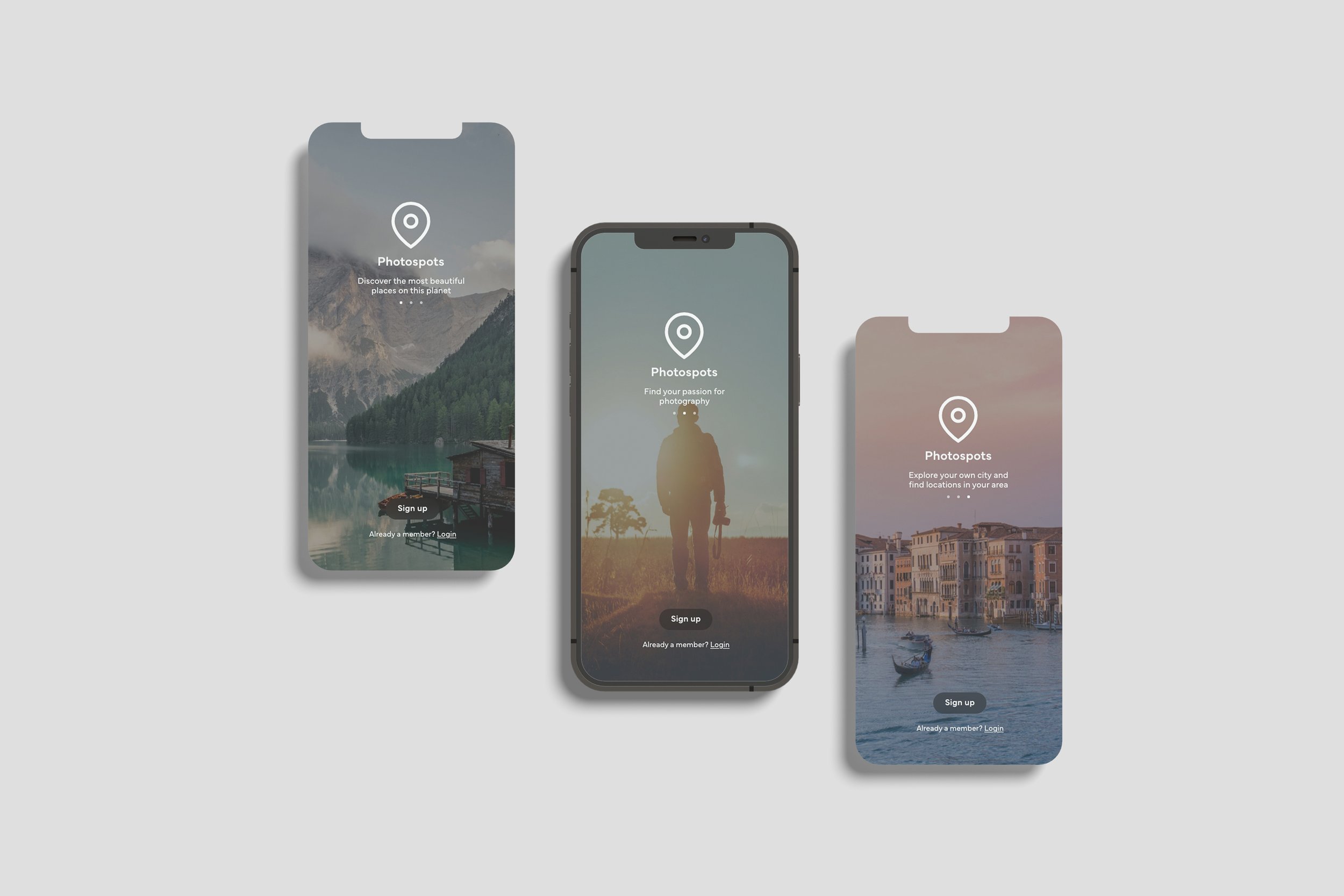
We can not expect users to understand the app right away. It's not even certain that the user knows what they have downloaded, as it often happens users do not read the app description before downloading an app. With a small introduction, a new user will be provided a short and simple explanation of what they can expect to see in the app.
Conventions
Conventions are norms users have become accustomed to overtime. Examples of this are menus, scrolling, and pressing buttons which are functions that have similar behavior across applications. It can also be described as unwritten guidelines and patterns for how a user experience should be designed. By using conventions, users will use the service more efficiently.



Web solution
The social media landscape is marked by intense competition, saturation, and a wide array of platforms. In this competitive space, Photospots positions itself as a distinct app tailored for dedicated photographers, prioritizing an exceptional user experience and simplicity.
To further enhance the user experience, I explored the creation of a web solution, offering a middle ground for users. Based on insights, it's evident that the current user journey for photographers can be needlessly protracted. With the introduction of an online solution, Photospots aims to streamline this journey, allowing users to swiftly download and share their photos with just a click from their computers. This significant enhancement sets Photospots apart from the crowd, presenting a unique value proposition that underscores user convenience and efficiency.
Advertisement
Visual tools represent a potent means of delivering a message, with video standing out as an adaptable and versatile format that can be seamlessly deployed across multiple platforms. The overarching objective behind sharing these videos is threefold: to cultivate awareness, evoke an emotional response within the intended audience, and guide visitors towards taking the desired action of downloading the app. Here are a few illustrative examples of how the app can be effectively promoted across various social media (SoMe) channels.
Kodus
Harry Phillips as voice actor
Dimitra Georgaki as voice actor
Footage from Pexels.com
Music by NEFFEX

