Norwegian Travel App
Night Mode
Type: Case
Target: Norwegian Air Shuttle ASA
My role: UX/UI Design
Industry: Aviation
Timeframe: 1,5 day
Date: September 2024
Design an intuitive and visually appealing dark mode for the Norwegian app that enhances the user experience, especially during nighttime use and in low-light environments. The dark mode will preserve the app’s core functionality while being consistent with the brand identity. At the same time, it should stand apart from the light mode in terms of color, contrast, and readability.
The Objective
Light Mode vs. Dark Mode
The debate between light mode and dark mode has been ongoing, with users divided over which is more comfortable and visually appealing. While dark mode reduces eye strain in low-light environments, light mode is often considered better for readability in bright conditions. Fun fact: early computers originally used dark mode with green or amber text on black screens. Light mode was introduced later to mimic the appearance of paper, making it more familiar and approachable for non-tech users.
Deciding whether a product should strictly be in light mode or dark mode doesn't align with a user-first approach. Ideally, products should offer both options, considering the diverse preferences and needs of different users. By allowing people to choose the mode that best suits their environment and comfort, you cater to a wider audience, enhancing accessibility and ensuring a more user-centric experience.
Disclaimer: In this particular case, there was only a task to consider the feature, but no actual user feedback on whether Norwegian Airlines customers would prefer a dark mode in the app. Therefore, much of the decision-making will rely on assumptions and common sense rather than direct insights from users.
With that said, here are some known benefits of dark mode.
On devices with OLED or AMOLED screens, dark mode can help conserve battery life by using less power for dark pixels. Travelers on long flights or waiting for their flights at airports may appreciate this feature, especially if they want to maximise their phone's battery life without constantly searching for charging stations.
Battery Life
Improved Accessibility
Research indicates that dark mode can help those with conditions like cataracts, where bright light complicates focus. Therefore, it’s important to respect users' system-wide display preferences, especially for those with visual impairments.
Focus and Readability
In dark mode, the content stands out more against the dark background, which can help users focus on important information such as flight times, boarding passes, or notifications. This feature can enhance readability and make the app's interface feel less cluttered.
Offering both light and dark mode provides users with a sense of control and personalization. Some users prefer having the option to switch modes depending on the time of day, their surroundings, or their personal tastes.
Option to choose
Many customers may be using the app in dark environments, such as while resting on a flight or preparing for an early morning or late-night journey. Dark mode reduces the brightness of the screen, making it less intrusive or disruptive to the user's surroundings.
Comfort
Dark mode’s aesthetic appeal is a significant draw for many users. Its sleek, modern look often creates a sense of sophistication and minimalism, making interfaces feel cleaner and more polished. The contrast between dark backgrounds and vibrant elements can make colors pop, enhancing the overall visual hierarchy and user experience.
Aesthetic Appeal
Conclusion
Many popular social media platforms, such as Instagram, Twitter, and YouTube, have embraced dark mode, recognizing its benefits for user experience. Additionally, major operating systems like Apple’s iOS and macOS, as well as Windows, now offer users the option to toggle between light and dark modes. On social media, dark mode helps draw attention to the content that matters most—posts, images, and videos—by minimizing distractions in the surrounding interface. The theory that bright colors and light attract attention, much like the “moth to flame” concept, supports the idea that a dark background allows users to better focus on the highlighted content, helping them prioritize what’s important.
In contrast, platforms like online shopping sites often remain in light mode. In e-commerce, the goal is to capture attention and convey information clearly, not to create a cozy, minimalist environment. Bright interfaces are more effective for showcasing product details, promotions, and calls-to-action, making light mode more suitable in this context where user focus is directed toward browsing and decision-making.
In conclusion, there’s no definitive “right” or “wrong” when it comes to choosing between light mode and dark mode. The decision should be driven by the specific context of use, the type of content being presented, and the preferences of the target audience.
Pressed for time, I dove into the task and began analyzing the app along with Norwegian’s visual profile and website. Since maintaining consistency with the brand identity was crucial, I needed to identify the key features and tokens that defined the brand. Understanding these elements was essential to ensure that the dark mode stayed true to Norwegian’s identity while still offering a distinct, user-friendly experience. This would serve as the foundation for a minimal design system I planned to create, which would guide the development of the app.
Design Analysis
The process
The design system I created consisted of design tokens such as color, font sizes, icons, and components. I ensured it stayed as close to the original as possible, while also modernizing and refining it. Given the requirements of dark mode, I introduced a new grayscale that would work well with the dark background, ensuring clarity and readability while still maintaining a similar feel to the light mode. This balance was key to keeping the design consistent with the brand, yet optimized for low-light environments.
Design System
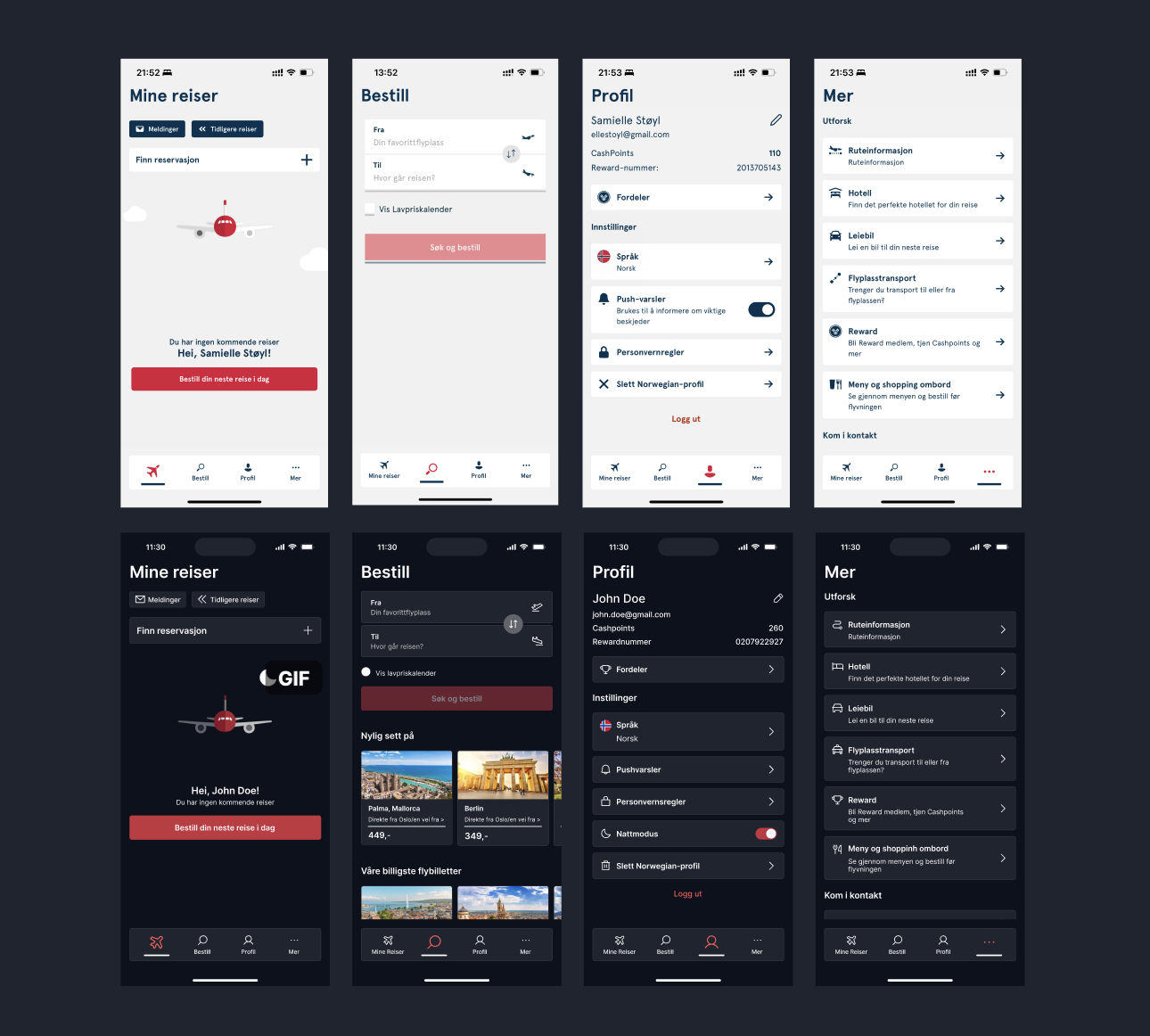
Through my analysis, I examined the app’s architecture and began wireframing the user journey in a similar manner, primarily following the existing navigation menu. This step was essential to create a seamless prototype that maintained the app’s core functionality. By aligning the dark mode experience with the app’s familiar structure, I ensured that users could navigate effortlessly without needing to relearn the interface, preserving a smooth and intuitive flow throughout the app.
Wireframing
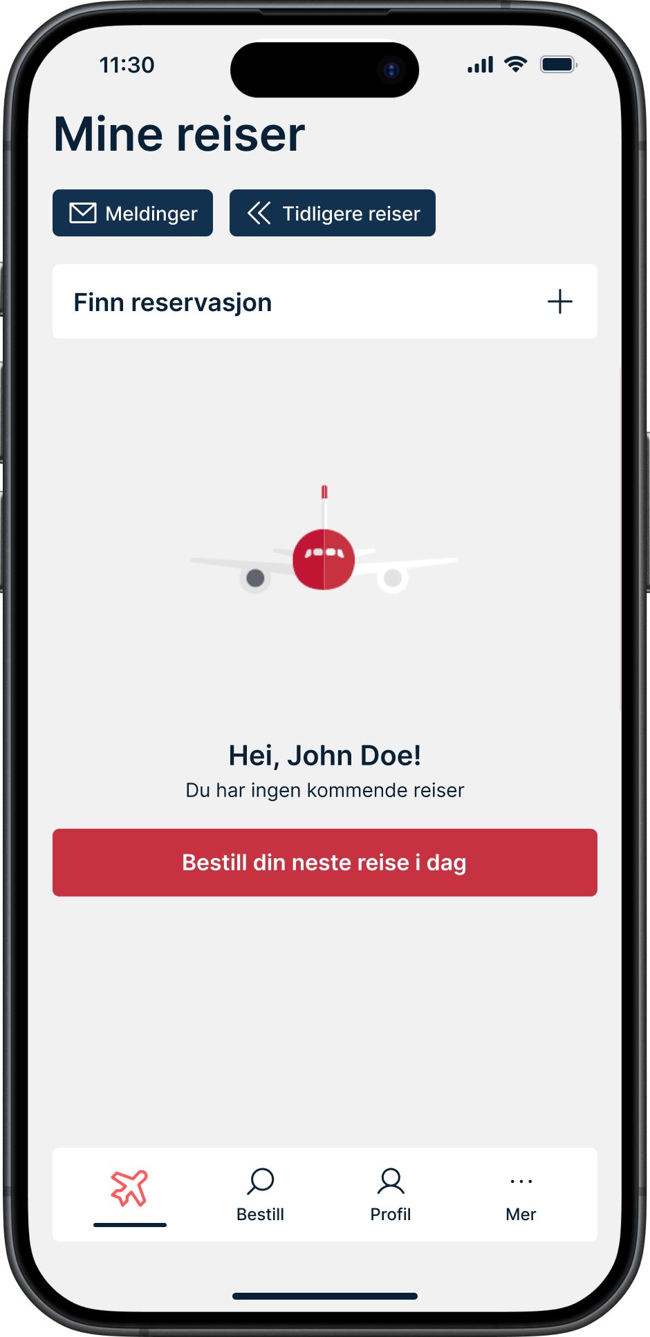
Light Mode
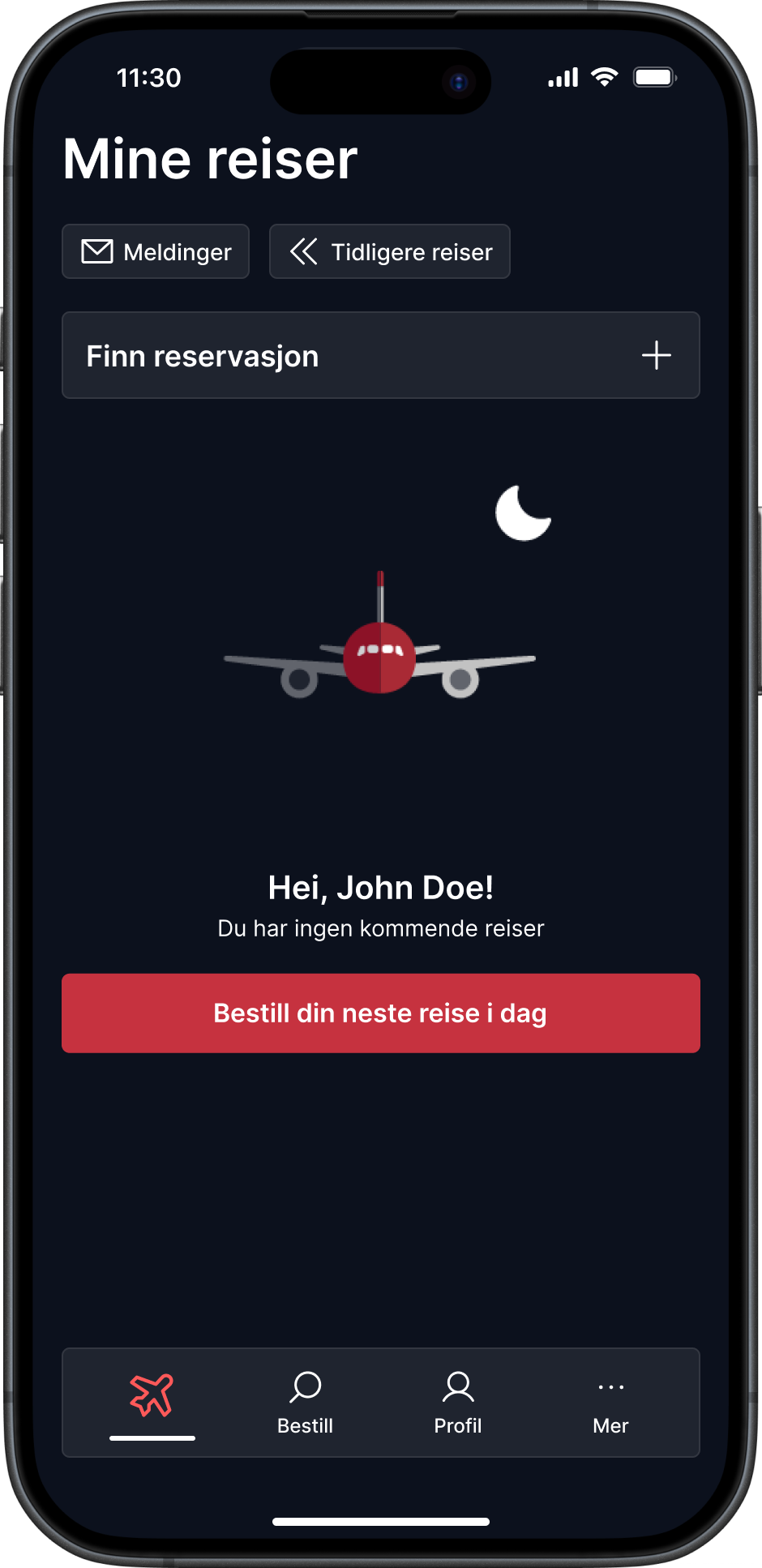
Dark Mode
Areas of Improvement
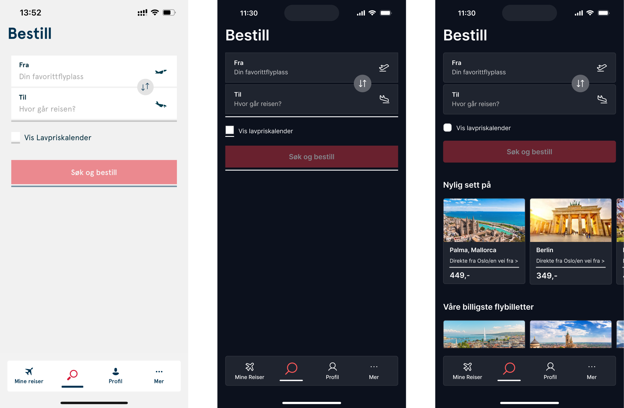
While the task requested that I maintain the same design, I still challenged it by showcasing improvements where I saw the need. During my analysis of the app, I observed that the booking page was inconsistent with the rest of the app, as it followed the website's UI instead. To address this, I created two versions: one that followed the exact design in dark mode, and another that introduced improvements to ensure consistency and add a call-to-action (CTA) for potential upselling opportunities.
The current booking page is limited in functionality, mainly catering to users who already know exactly where and when they want to travel, without considering budget flexibility. For users who are unsure and want to explore different destinations, prices, and dates, the app falls short. This often leads users to give up and switch to the website instead. My improved design aims to offer a more exploratory experience, allowing users to easily browse options within the app.

